Client

The Maloney-Shamie Vision Institute

Industry

Ophthalmology

Location

Beverly Hills, CA

Services
  • Design
  • Photography
  • Video
  • SEO
  • Digital Advertising
  • Social Media
Platform
  • Custom HTML
  • Responsive Design
Release

2019

Project Mission Create a robust and informative online presence.

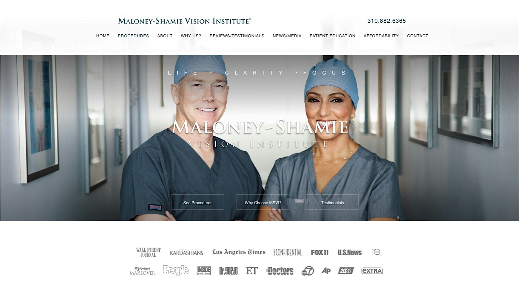
Drs. Maloney and Shamie intended for their vision institute to be the final stop for patients experiencing difficulty finding the optometry answers they were looking for. Reassuring vibes and confident copy were the orders of the day for this gorgeous new site.
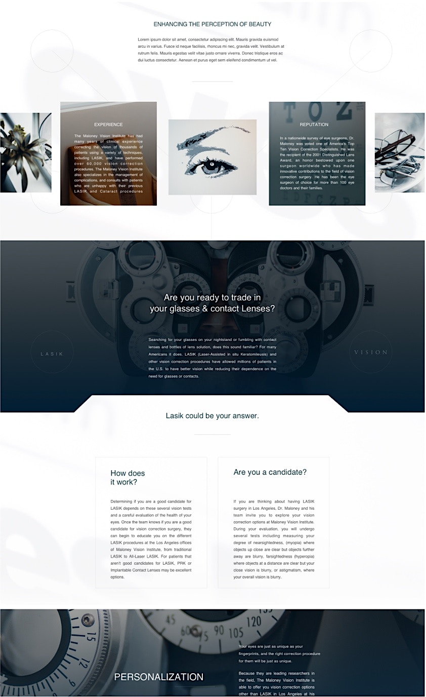
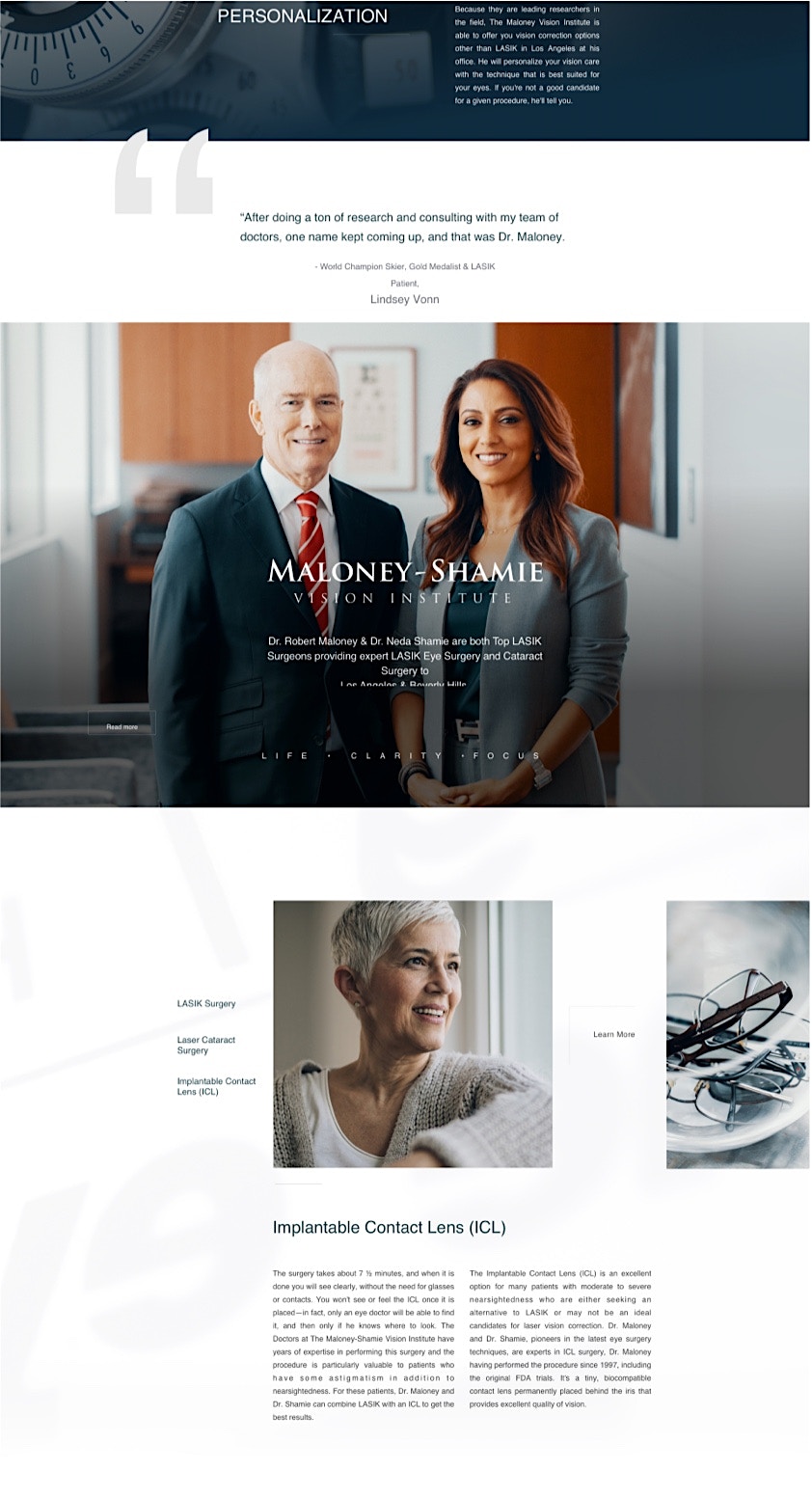
Design & Layout Crafting a sense of refinement and expertise.

Our goal with this site was to replicate the clarity of vision one will experience after a procedure at the Vision Institute. Since this site involves some technical information, we crafted a clear hierarch of information, with a crisp and modern design sensibility that encourages users to take action and set up a consultation.

Building Trust Through Imagery Communicating an unparalleled level of expertise.

Vision correction can be something of a process, and Dr. Maloney’s Vision Institute is the end of the line. We wanted to convey all the confidence and personability that come along with this staff’s impressive level of experience, for a reassuring and comforting look and feel.

Building Trust Through ImageryKeeping the client and their customers connected.

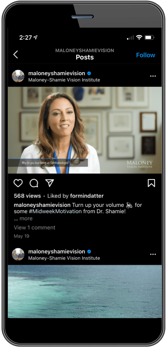
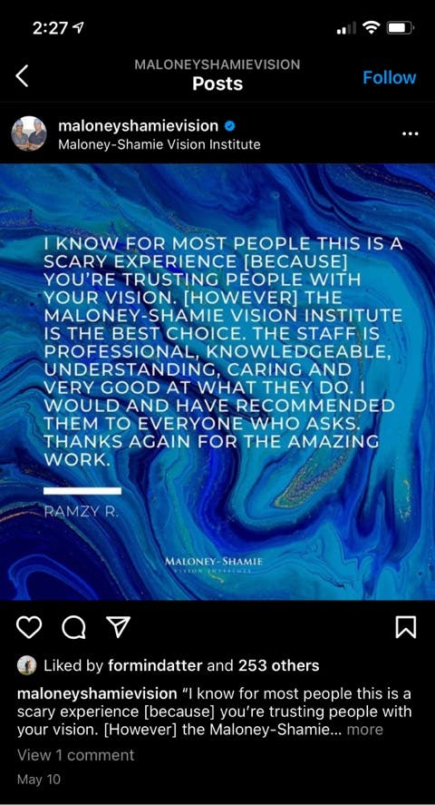
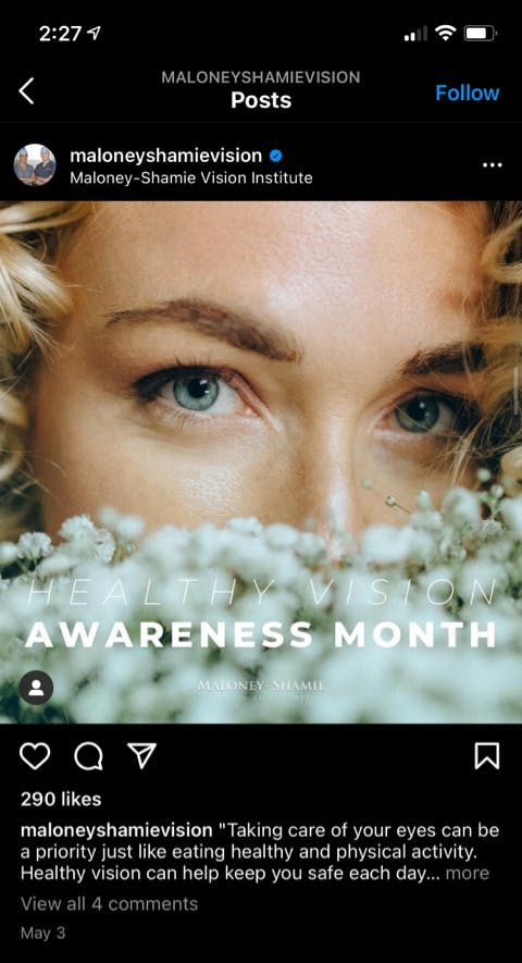
Few medical procedures have as direct an impact on one’s overall quality of life in the way that vision correction does, so we designed a social campaign that reaches potential customers on a deeply personal level. Connecting the Vision Institute with social users on visually-oriented platforms like Instagram allows us to build a more intimate connection and encourage direct action.

UI Guide | Style, Typography, Color Palette Calming colors for a classy atmosphere.

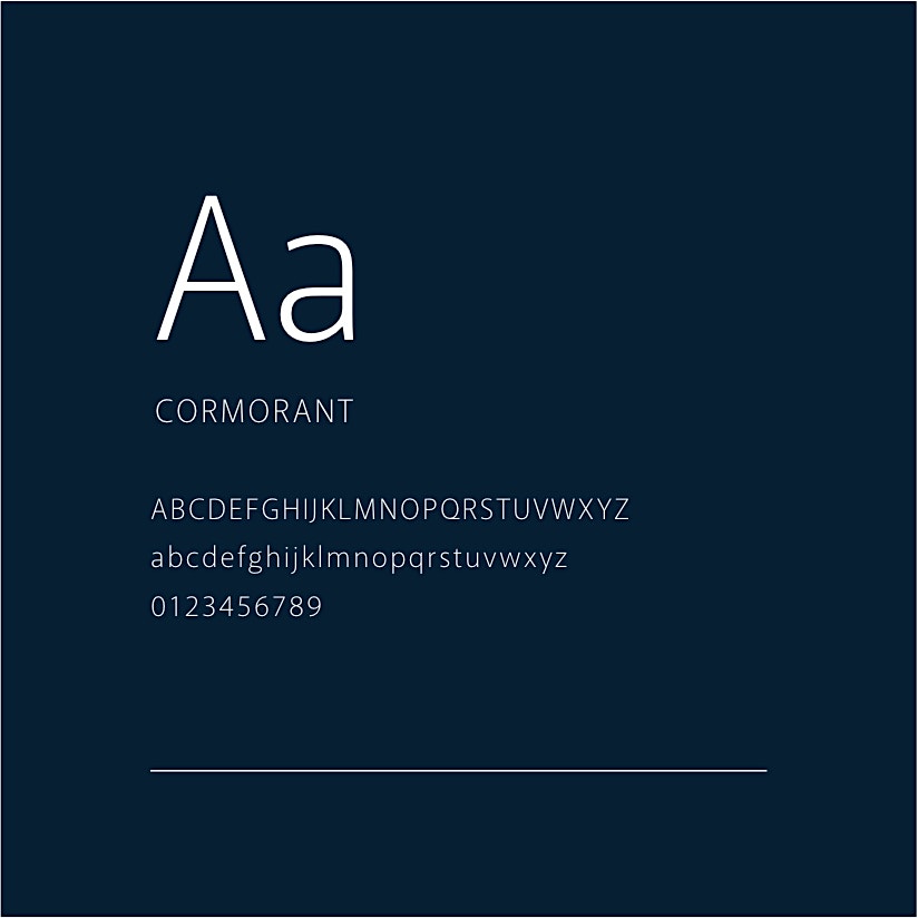
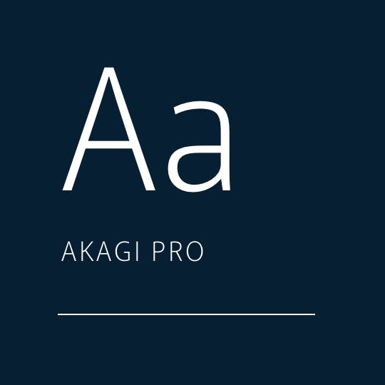
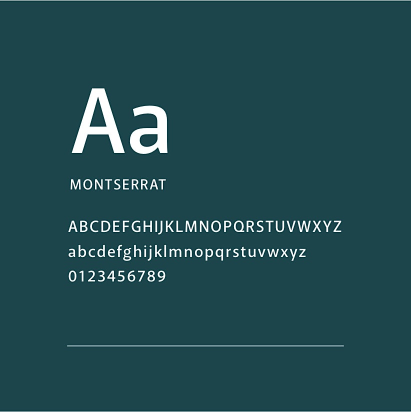
The Vision Institute was designed to offer visitors a sense of reassuring confidence, so we opted for a cool and calming color palette that features deep greens and dark navy blues, offset by the white space and soft, slate-grey detailing. Two sans-serif fonts, Montserrat and Cormorant, add a touch of modernity and directness to the copy.

26434A
0D1E31
E2E2E2
F9F9F9
Text Us
Hi there, have a question? Text us here.

Enter your information, and our team will text you shortly.

This field is required.
Get in touch
Contact Us Media

Have a specific question or just wanna chat?

This field is required.
Get in touch

Get on the good foot

Find marketing peace with our comprehensive accountable approach.

Give us a call!


(888) 351-3514

© Studio 3 Marketing. All Rights Reserved.

Terms & Conditions Privacy Policy Sitemap

Contact Us